← boo-studios.com
Boo!Studios Selected work · 2026

I don't start from a blank canvas. I start from the one‑star reviews.

Four of these are rebuilds of a working competitor with unhappy users: I read every complaint I could find, kept the ones I could verify, and turned each into a design decision you can point at on the screen. The fifth, Shouty, is a brand and website concept. Below: what people complained about, and exactly what I did instead.

Complaint themes, closed

  • Filters make the results bigger
  • The paywall lands after a five‑minute quiz
  • Cook mode shows the wrong photo
  • The app lost my entire inventory
  • Ads and trackers crept in

Each line is a theme drawn from a real product's reviews, issue tracker or launch thread, grouped and paraphrased rather than quoted. Every one of them has a fix in the four cases below.

What this is

Self-initiated work, built end to end.

Nobody briefed these. I picked the problems, did the research, designed the product and built it until it ran on a real device. That means every decision here is mine to explain, including the ones I got wrong first.

Kasper Vervliet — Senior Product Designer & team lead at Teamleader by day, Boo!Studios by night.

5 projects, 7 builds 31 complaint themes closed research → design → shipped

The method

Three steps, always in this order.

STEP 1

Find a product people use and resent.

A rating that splits hard across platforms is the tell. SideChef sits at 4.7 stars on iOS and 3.8 on Android. That gap is a design brief.

STEP 2

Read every complaint, then throw half away.

App Store, Play, aggregators, Hacker News threads, GitHub issues. Group them into themes and drop anything I can't verify in the product itself.

STEP 3

Make each theme structural, not a backlog item.

A fix that relies on remembering to be careful will break. The good ones change the shape of the thing, so the complaint can't come back.

Shouty

Website design · accountability platform

Self-initiated concept · site, brand and social

A website design for an accountability platform.
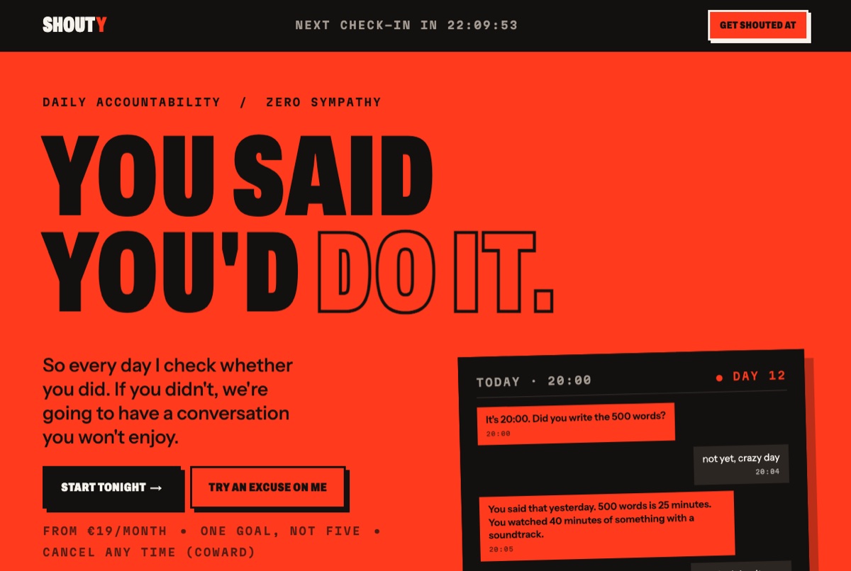
Shouty's hero: a full-bleed siren-red band with the headline You said you'd do it. set in heavy condensed capitals, beside a dark mock-up of a 20:00 check-in conversation.
Hero
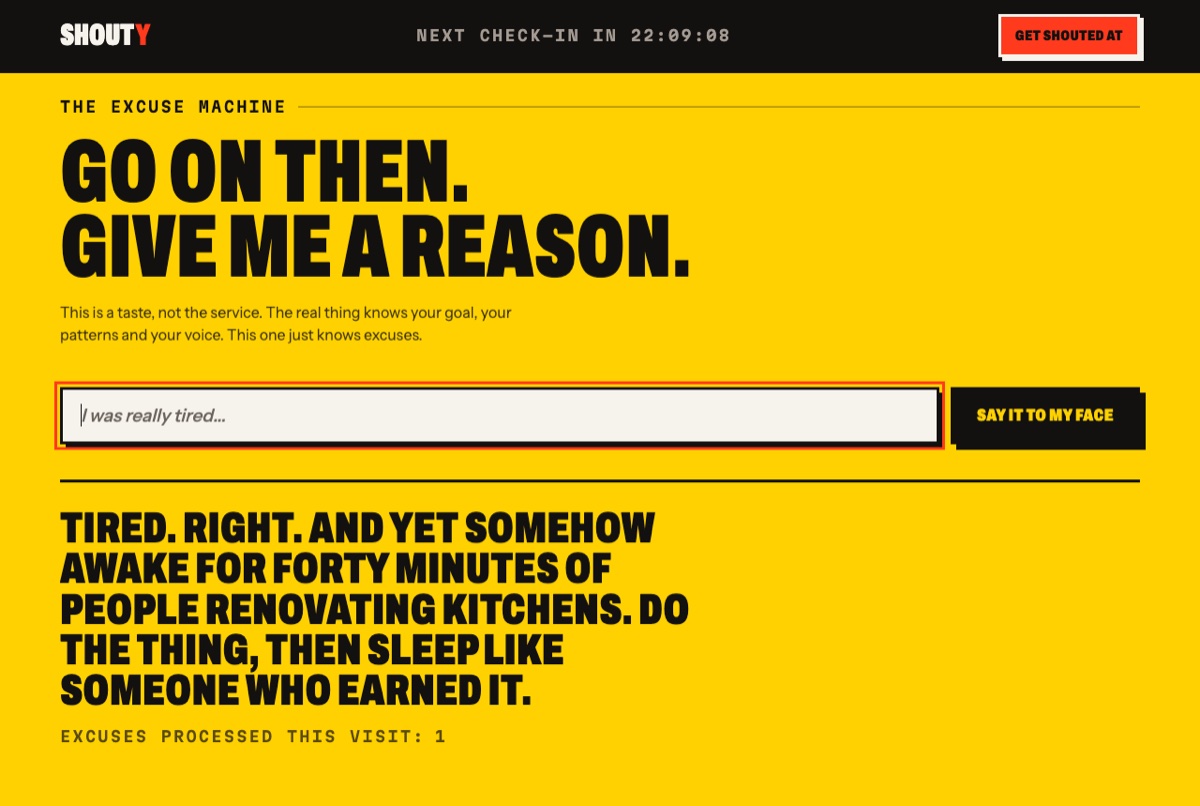
The Excuse Machine on a hazard-yellow band: a text field holding a typed excuse, and underneath the shouted reply in heavy black capitals.
The Excuse Machine, answering
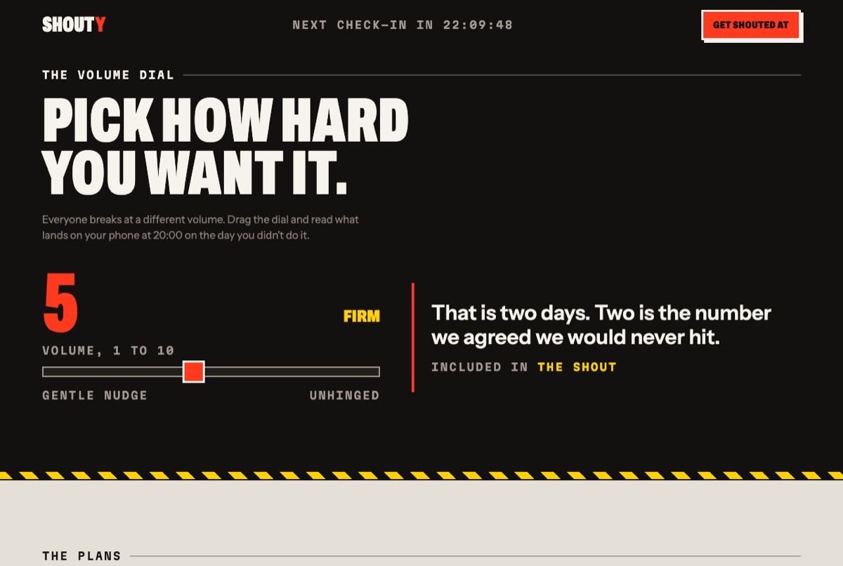
The Volume Dial on a near-black band: a numbered slider running from Gentle nudge to Unhinged, with the message it produces shown beside it.
The Volume Dial
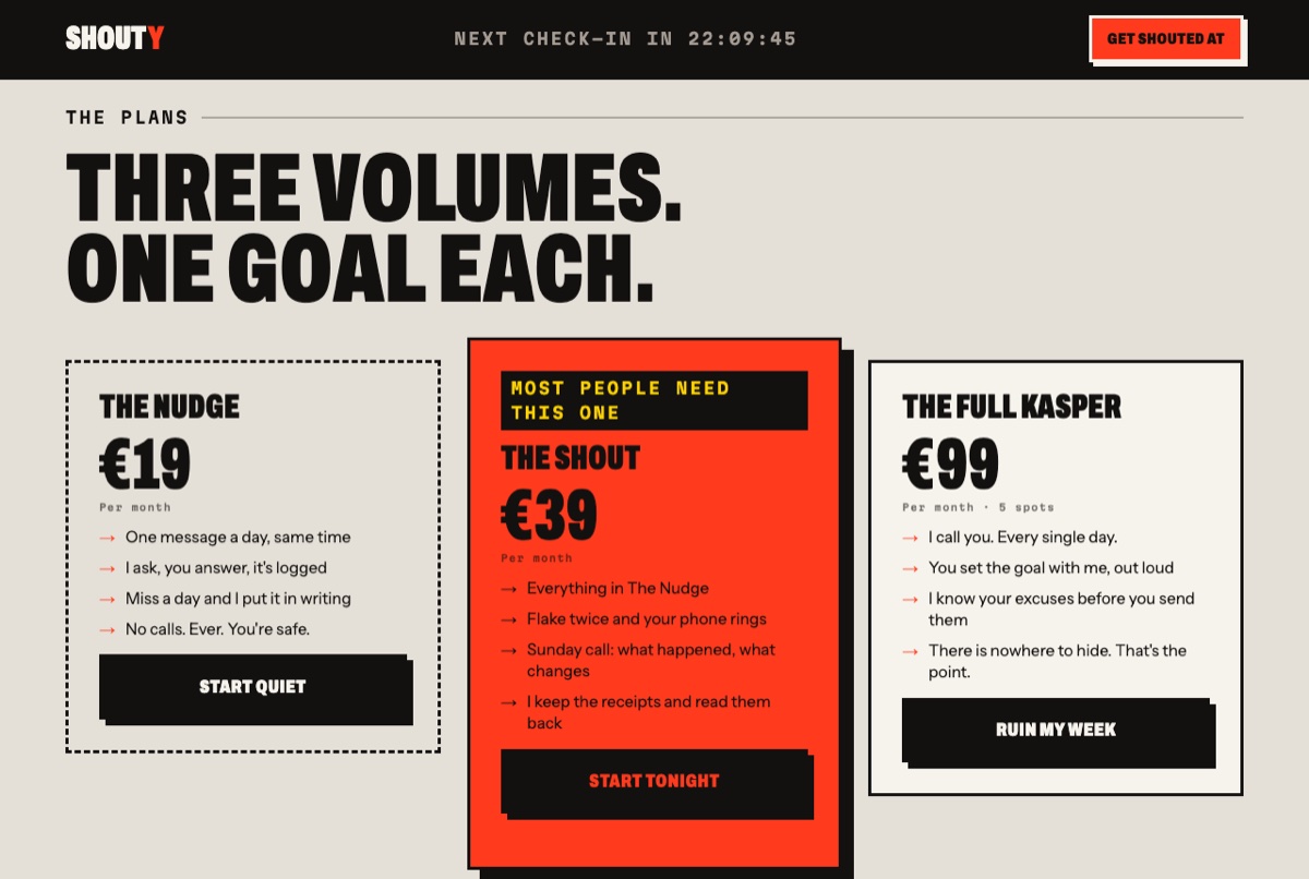
The plans band on warm concrete grey: three price cards, the middle one in siren red and flagged Most people need this one.
Three plans
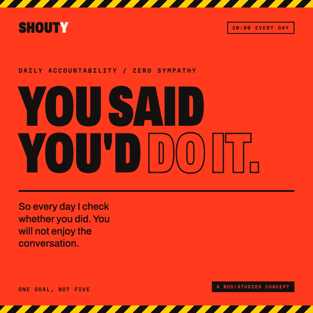
Square social post in siren red, framed top and bottom with black and yellow hazard tape. The headline You said you'd do it. runs in heavy condensed capitals with Do it. reversed to outline.
Social — square post
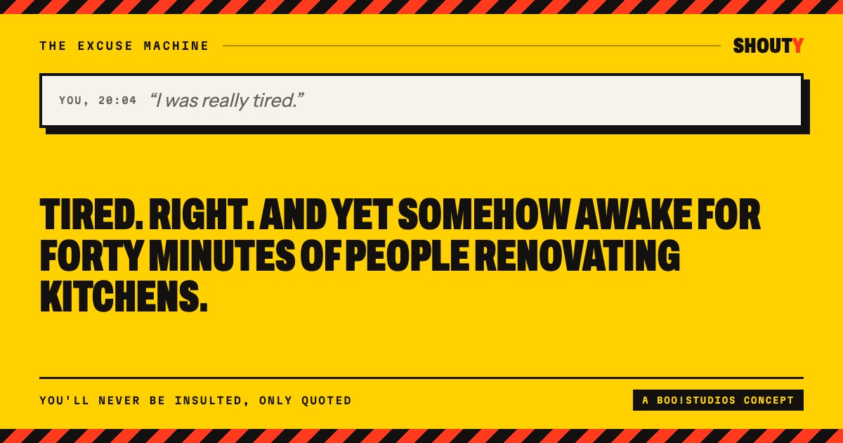
Landscape social card in hazard yellow: a quoted excuse in a bordered field above the shouted reply in heavy black capitals.
Social — link card

Saucery

Cooking app · web, tablet, mobile

Rebuilt from SideChef — iOS 4.7★ · Android 3.8★ · NPS −34
Second pass at my own Pocket Chef (June 2026), which came from a spec instead of from reviews

A 4.7-star app with a minus-34 NPS. The whole gap was sitting in the reviews.
The complaintWhat I did instead
Filters widen the results instead of narrowing them.
AND-logic facets, each carrying a live count. Stacking a filter can only reduce the number, never grow it. Filter state lives in the URL, so a reload keeps it.
Allergy settings get ignored by recommendations.
One catalogue gateway hard-filters allergens before any surface renders: search, planner, swaps, related, pantry. There is no path that bypasses it.
Cook mode shows the previous step's photo.
Step content is keyed by step index and remounted per step, so a stale image is structurally impossible. All step photos preload.
My own recipe edits silently fail to save.
Saving writes, reads back, verifies, and only then confirms. A failure shows a loud, persistent error with retry, never a false "saved".
Auto-renew trap, and no way to cancel.
A reminder three days before any charge, one-click cancel that keeps access until the period ends, and self-serve delete-everything. Settings stays reachable even behind the paywall.
Demo food data always looks fake.carried over from Pocket Chef
66 real recipes scraped from HelloFresh.be with full ingredients, steps, nutrition and photography, deduped across 27 cuisine categories. 78 in total, shared by both builds.
10 themes → 10 decisions 98 recipes 121/121 logic checks pass
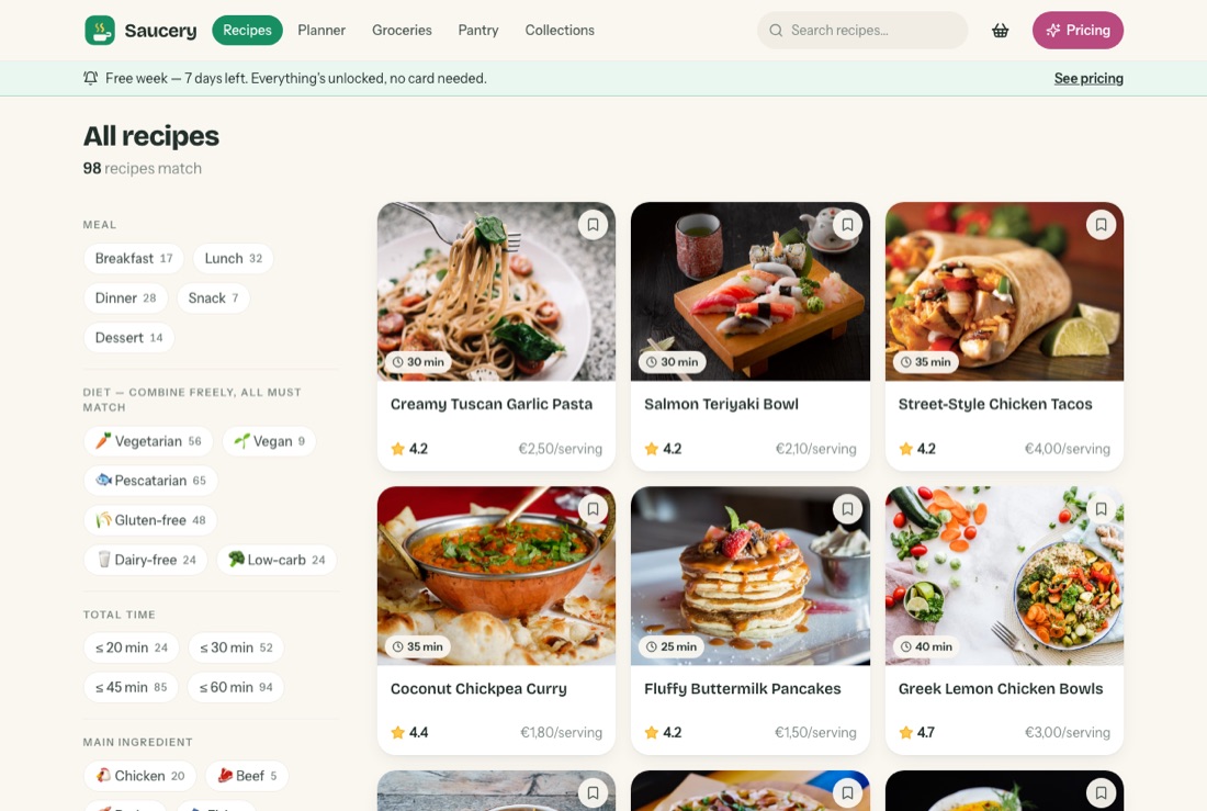
Saucery's browse screen: a left rail of filter facets, each showing a live count, beside a grid of recipe cards with time, rating and cost per serving. The header reads 98 recipes match.
The fixEvery facet carries its own count, and the header keeps a running total. You can watch 98 shrink as you stack filters, which is the one thing the original couldn't do.
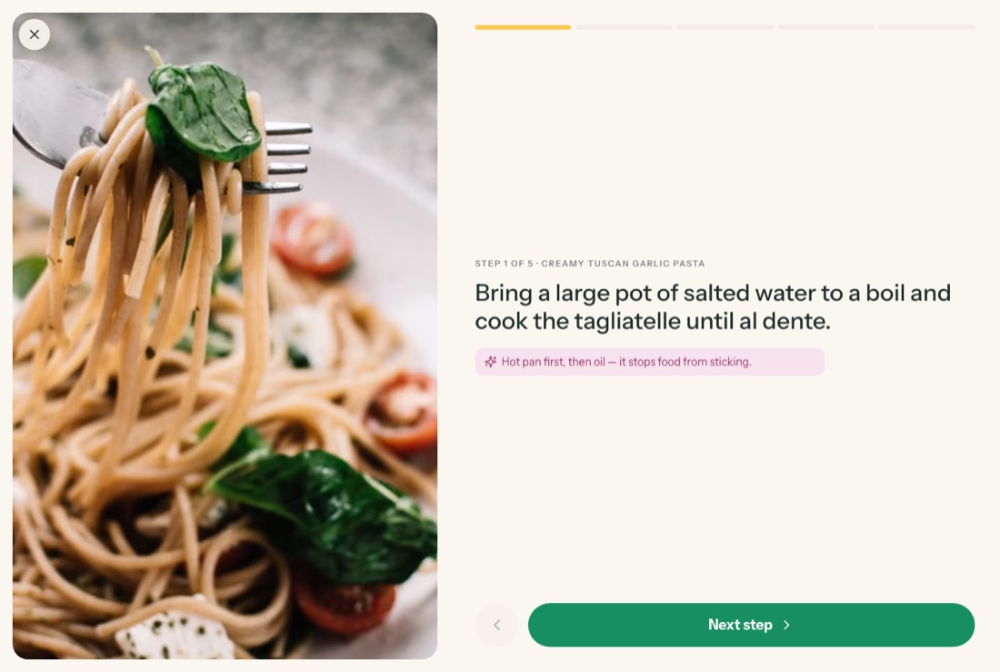
Saucery's cook mode in landscape: a large photo of the dish on the left, and on the right the label STEP 1 OF 5, the instruction, a technique tip and a Next step button.
The fixCook mode, landscape, propped against the wall. The header names the step you're on and the photo belongs to that step, because the content is keyed by index and remounted.
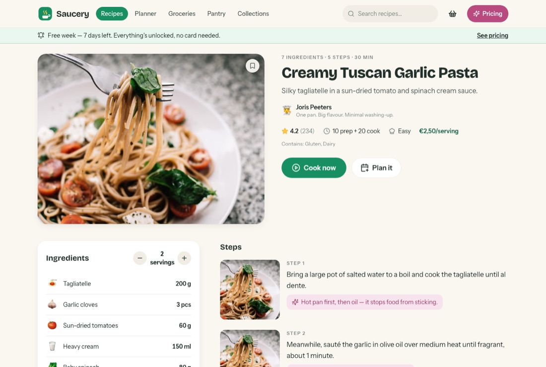
A Saucery recipe page: hero photo, title, creator, rating, prep and cook time, difficulty, cost per serving, an allergen line reading Contains Gluten Dairy, a servings scaler and photo-per-step instructions.
The fixRecipe page. Allergens are declared on the page, not buried in settings, next to cost per serving and a 1-to-16 servings scaler that rewrites every quantity.
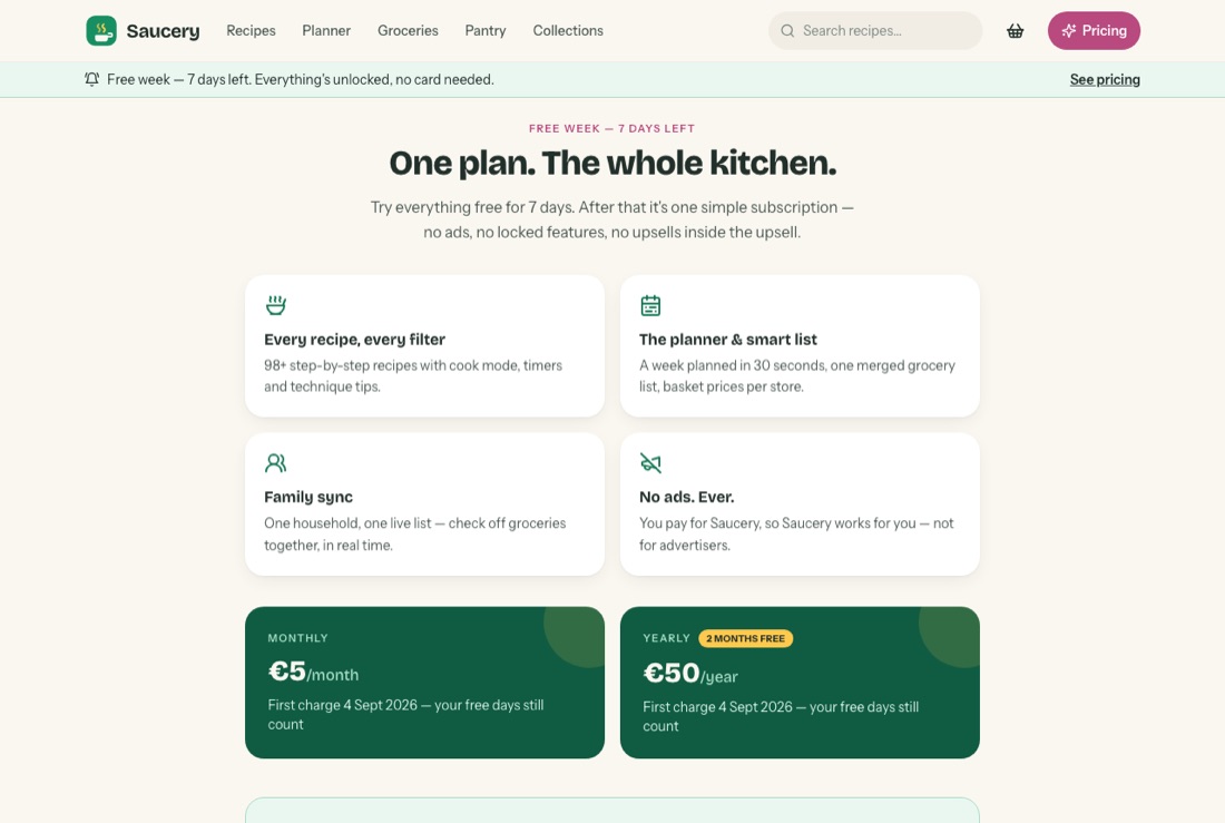
Saucery's pricing page headed One plan, the whole kitchen, listing what is included and stating the free week has seven days left with no card needed.
The fixOne plan, the whole app. The free week runs without a card, so nothing can auto-charge, and the no-tricks policy is written on the page rather than implied.
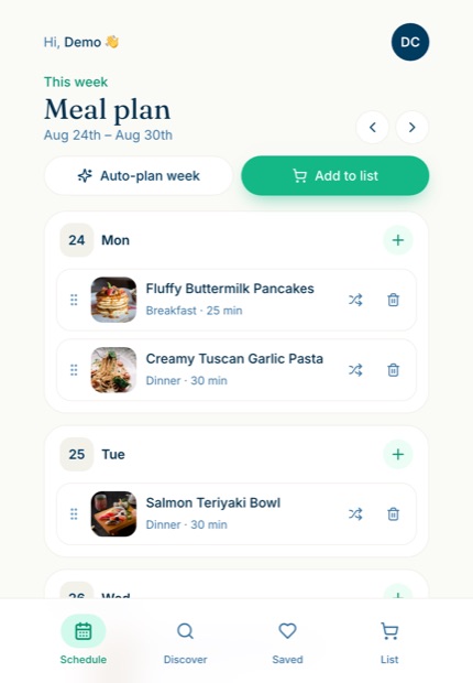
Pocket Chef's meal plan on a phone: a week of dated day cards holding recipe rows with thumbnail, meal type and cooking time, each with a drag handle, swap and delete control.
First passPocket Chef, June 2026. Same idea, built from a written spec before I'd read anyone's reviews. Auto-plan week and Add to list sit side by side: plan it and shop it, one gesture apart.
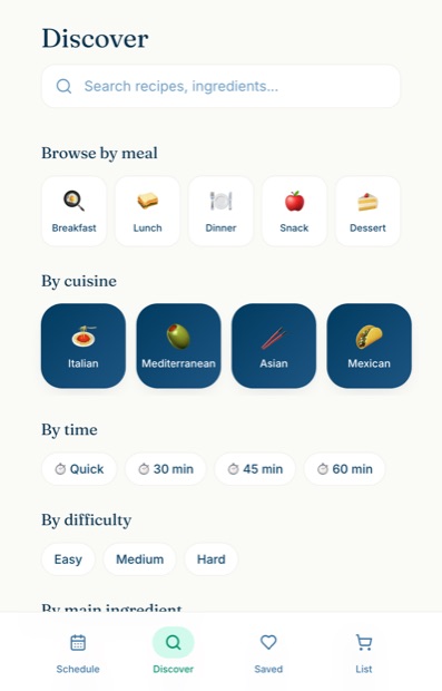
Pocket Chef's discover screen: a search field, then browse-by rows for meal, cuisine, time, difficulty and main ingredient, each a row of tappable tiles.
First passPocket Chef's browse, and the whole argument for step 2 of the method: the spec version has no counts, so you can't tell what a tap will cost you until you've made it.

Wakey

Accountability alarm · PWA + landing page

Rebuilt from Erly4.8★, and a review section full of people who felt tricked

The app worked fine. The paywall was the product problem.

The complaintWhat I did instead
The paywall lands after a five-minute quiz.
Pricing sits on onboarding step zero, before you've invested anything. The whole flow takes about 75 seconds and the core stays free forever.
A three-day trial.
Fourteen days, no card. Nothing exists that could charge you by accident, and when the trial ends you land on Free rather than on a wall.
The AI missions fail and the alarm won't stop.
Deterministic missions only, maths, memory, affirmation and shake, with a maths fallback that appears automatically after 60 seconds. Nothing depends on a model responding.
The alarm gets stuck ringing. Or never fires at all.
An emergency dismiss you hold for ten seconds. It works, and it costs you the streak. Plus a test-alarm button, so you find out before 6am.
Five confusing price tiers.
Two. €5/month or €50/year. The yearly price is a genuine two months free, so the badge saying so is honest.
pricing visible at second 0 trial 314 days tiers 52
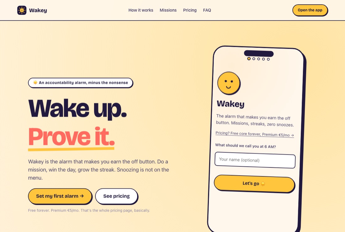
Wakey's landing page in yolk yellow and plum: the headline Wake up. Prove it. beside a phone mockup of the first onboarding step, which links to pricing.
The fixThe landing page. The line under the buttons reads "Free forever. Premium €5/mo. That's the whole pricing page, basically." Nothing is being saved up for a reveal later.
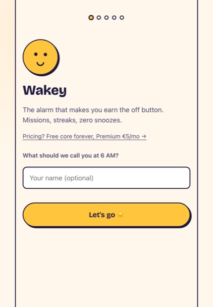
Wakey onboarding step one on a phone: the Wakey mark, a one-line pitch, a link reading Pricing? Free core forever, Premium five euro a month, a name field and a Let's go button.
The fixOnboarding, step one of five. The pricing link is already on screen, at second zero, before you've typed your name. Erly put its paywall five minutes in.
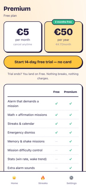
Wakey's premium screen: two price cards, five euro per month and fifty euro per year with a 2 months free badge, a Start 14-day free trial no card button, and a free-versus-premium comparison table.
The fixTwo tiers, not five. The yearly price really is two months free, so the badge is honest, and the line underneath says what happens when the trial ends: you land on Free. Nothing breaks, nothing charges.
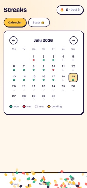
Wakey's streaks calendar for July 2026: a month grid where each day carries a coloured dot, with a legend reading won, lost, rest and pending, and a streak counter showing 6, best 6.
Streaks, with four states rather than two: won, lost, rest and pending. A rest day doesn't break the run, which is the difference between a streak you keep and one you abandon in week three.

Forge

Workout builder · installable PWA

Rebuilt from workout.cool — complaints sourced from its Hacker News launch thread and GitHub issues

An open-source launch that went sideways in public. Every complaint had an issue number attached.
The complaintWhat I did instead
The auto-generated workouts are badly programmed.
The generator dedupes movement families, puts compounds first and big muscles before small. It follows the rules a coach would.
Premium flags gate the self-hosted install.#177 · #194
No premium flag exists anywhere in the code. Everything is free, and the Supporter page paywalls nothing.
The exercise database is missing and CSV import is broken.#66 · #111 · #167
70-plus exercises with coaching cues ship inside the file itself. Nothing to import, nothing to fetch.
Ads, analytics and trackers crept in.#242 · #237 · #207
Zero third-party services and zero network calls. Your training data never leaves the device, because there's nowhere for it to go.
The back button exits the whole app.#80
Hash routing, so back goes back. Plus the iOS details: safe-area insets, 16px inputs so focus doesn't zoom, standalone status bar.
10 complaints → 10 fixes 70+ exercises 0 network calls 1 HTML file
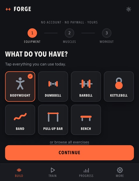
Forge's build step on a phone: a dark screen headed WHAT DO YOU HAVE with a grid of two-tone equipment tiles for bodyweight, dumbbell, barbell, kettlebell, band, pull-up bar and bench, plus a link reading or browse all exercises.
The fixStep one of three, and the escape hatch is right there: "or browse all exercises". That link is the answer to "beginner-hostile onboarding". You're never trapped in the wizard.
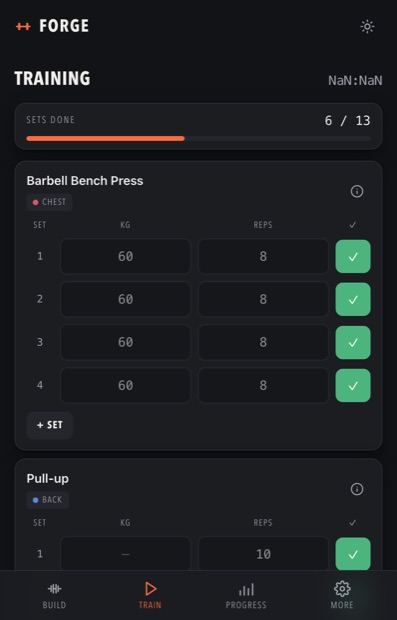
Forge mid-session on a phone: a header reading TRAINING with a running timer, a progress bar showing 6 of 13 sets done, then exercise cards with per-set weight and reps fields and green tick buttons.
The fixA session in progress. Last weights are prefilled and decimals are allowed (22.5kg), which were two of the missing basics in the issue tracker. Sets done is a count, not a feeling.
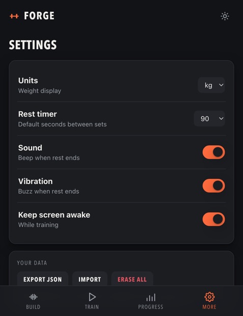
Forge's settings on a phone: rows for units, rest timer, sound, vibration and keep screen awake, then a YOUR DATA section with Export JSON, Import and Erase All buttons.
The fixSettings, and the part that matters: Export JSON, Import, Erase all. One unit setting rules every number in the app, which closes the mixed-units bug. There's no account to delete.

Frostbox

Freezer inventory · iOS + Android

Rebuilt from Freezer Manager10k+ installs · ~3.6★ · unmaintained since 2020
Second pass at my own Freezentory (June 2026), the web version that came first

The whole category's defining failure is losing your inventory. So the brief wasn't features. It was survival.
The complaintWhat I did instead
The app lost my entire inventory.
Five independent places an item survives, each one defeating a different failure. The chain is drawn out below.
Entering anything is tedious.
Barcode scan against Open Food Facts, plus a correction cache: fix a wrong product name once and your version wins on every rescan. Quick-add rail, steppers, smart best-before per category.
Family sharing is broken, or missing entirely.
Offline-first sync with households and invite codes. Realtime updates, and last-write-wins enforced by a server trigger rather than hoped for on the client.
It slows to a crawl past 100 items.
Indexed SQLite behind a virtualised list. Tested at 600 items.
The trial ends and I'm locked out of my own data.
Expiry makes the app read-only, not empty. Browsing and export stay free forever. Data is never held hostage.
6 themes → 6 decisions 7 rolling snapshots tested at 600 items
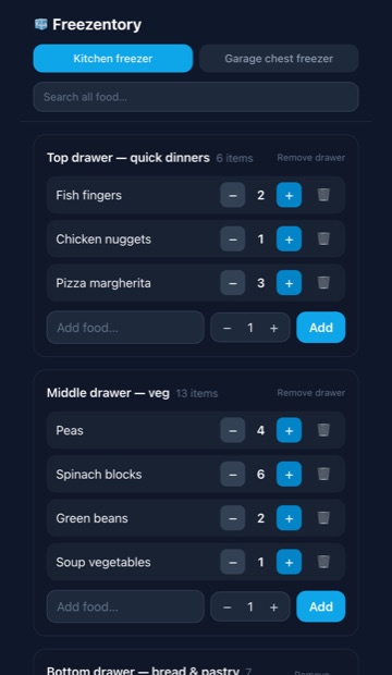
Freezentory on a phone: a Kitchen freezer and Garage chest freezer tab pair, a search field, then drawer cards named Top drawer quick dinners and Middle drawer veg, each listing food items with minus and plus quantity steppers and a delete button.
First passFreezentory, June 2026. The web version that came first: freezers, then named drawers, then items. Every row is a stepper, because the real action in a freezer app is "there's one bag left", not "edit item".
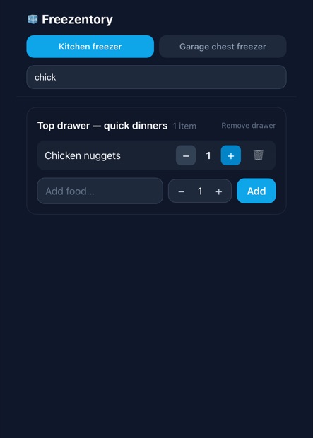
Freezentory with the word chick typed into the search field: the drawer list has collapsed to a single Top drawer card holding one matching item, Chicken nuggets, and the drawer count reads 1 item.
First passSearch across every freezer at once. Type four letters and the drawer counts recount themselves, so you can see where a thing is without opening anything. This is the idea Frostbox kept.

Frostbox, the rebuild — a diagram, not a screen

Frostbox runs on a phone through Expo, so there is no browser screenshot to show and I'm not going to fake one. This is the architecture, drawn honestly, and for a "never lose your data" brief it's the more useful picture anyway.

What it costs to have me do this on your product

Same method. Your roadmap instead of my side projects.

One plan, one price. I'm in your Figma every working day, most requests come back in 24 to 48 hours, and bigger pieces get split into chunks you can actually ship. Two client spots, because I do the work myself.

€3,500per month · design partner

The call is free and there's zero commitment. 24 to 48 hours is an average, not an SLA.